Julie Rafalski
A Book About Mies van der Rohe
While preparing for my exhibition in Chicago this spring, I have been looking at Mies van der Rohe's architecture. My sourced material has been mostly second-hand books. I like the idea that these books are artefacts in themselves. They serve as a document not only of the architecture but the time they were published as well. The photographic and graphic design conventions of the day are preserved in these books. It's interesting how these conventions now draw attention to themselves. A book designed in the 70s has a certain feel to it. This "feel" then becomes another context for looking at the subject matter of the book.
My copy of one book on Mies van der Rohe, published in the 1970s, has a worn dust jacket and the dirty yellow cloth binding is faded around the edges. The several colour prints in the book are fuzzy, as if during the printing process, the CMYK plates were slightly off. The photographic 'plates' show the Illinois Institute of Technology, the Lakeview Apartments, the Highfield House, the Seagram Building…
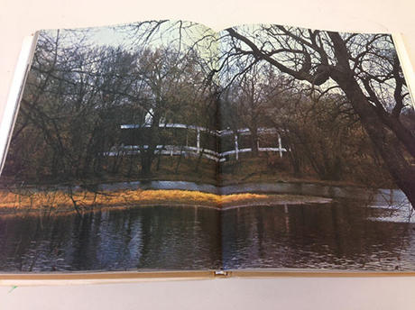
One page shows the Farnsworth House, in the autumn sunlight. If one looks closely at the house, one sees the dot screen printing pattern, which gives the sleek white supports of the building subtle stripes. On another page the house is seen photographed through the bare trees, whose dark brown shades remind me of a Caspar David Friedrich painting. The house is barely visible in this photograph, it could almost be a structure under construction, or a long forgotten ruin of a highway.
Another page shows interiors of buildings part of the University of Chicago. These are all lifeless, with no people in them. They almost seem like they are maquetes made out of paper. The eerie emptiness within these geometric environments make them seem almost like a stage set. Perhaps the view out one window is not really the Midway of the UC campus but a printed backdrop?
Looking through these pages I think of grid paper and how these buildings must have looked when drawn on its 2 dimensional surface. Rows and columns of perfect clean grey rectangles and squares. Then I think of some buildings that I have actually visited. Experiencing these buildings in the flesh was very different. The Chicago Federal Center, where I once got my passport renewed had a monumental quality- that doesn't necessarily translate to the printed page. Berlin's Neue Nationalgalerie also has this quality and when walking through it, one feels like a tiny spec of dust, in relation to the massive scale of windows and the endless ground level space with almost no walls.
But on these pages of the worn book, Mies' buildings are deformed by the printing ink, the warped pages, the musty smell, the archaic feel of the pages. When a building is captured in a still image, it takes on a life of its own. It is transformed into something else, perhaps a different type of architecture.